As an organization or a business that has a website or intends to build one, it is very important to note the key elements of a good and highly converting website. One of such key factors is the “About Us Page” also known to others as the “Website Portfolio” or “Webfolio”. It is also very crucial to time a lot of consideration and time in developing and designing a stunning website portfolio for your business.
Many organizations have made the mistake of thinking an “About Us Page” just carries the name of their team and so on. But in reality, it encompasses that fact meaning it is supposed to be well-fashioned in a fun and interesting way. This makes it easier for your clients and site visitors to establish a person-to-person connection across the wide scope of the internet.
No matter how the type of business or organization you run, understanding and trust are major factors. So, for your clients to understand and trust your business, they must, first of all, know more about it which has a lot to do with the “About Us” page. Nevertheless, to build a catchy, beautiful, informative, personable & interesting about your team page, you have to follow these rules.
Following this formula will definitely make your prospective clients fall for your brand or organization. Using the rules, the About Your Team page should focus on:
- Customers persona and the value they will get from your brand
- Testimonials, case studies, and other facts & recommendations that prove the value of your brand
- Visual pages with an appeal using photos and videos
- Showing charisma and character
Every business has a different customer persona and it is in this regards that we have come up with some of the best 25 Creative and Excellent About Us Page Designs online. This is to help you create or restyle the “about your team” page into a masterpiece.
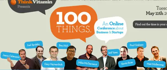
Think Vitamin Online Conferences
Think Vitamin is one of the freshest, minimalistic websites we have seen. It showcases a layout on their website that encourages you to be a coder, yes to learn how to code. It is very informative and straightforward as you understand what the website is all about at the first look at it. If you want to learn to code from a fresh website, you can visit their page.
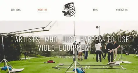
FortyOneTwenty About Us Page
This is another very good example of a converting about us page. The guys at FortyOneTwenty really did a great job with their web folio which distinguishes them team as “artists that use video equipment” to express their work. It is this type of artistry that gets you when you want to hire a creative team. Still on their about us page, when you scroll down you see testimonials again describing them as the “Navy Seals of the Film World”, with reference logos to top brands they have worked with. It is awesome!
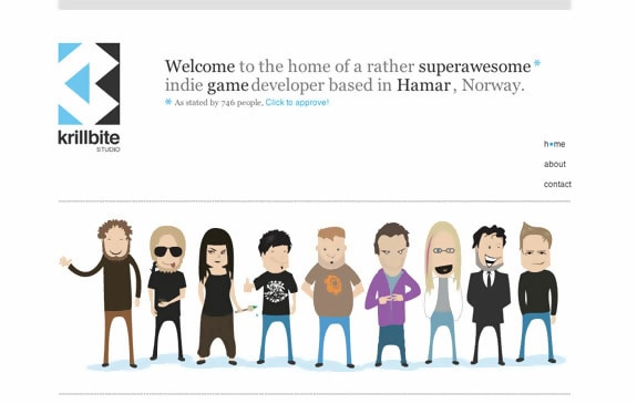
Krillbite
Who doesn’t love games, we can testify that games are super cool and awesome! Krillbite website is a game website located in Hamar, Norway. The first look at the website showcases some games which are super cool to look at, tell me, aren’t we visual beings? The website is fresh, cool, and super awesome. Yes, you guessed right, we love games.
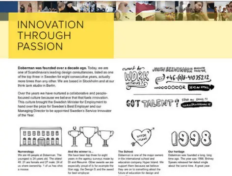
Doberman
Doberman did very well with their about us page, which connects its brand and visitors emotionally. They did a phot mix of people combining work and fun, which is perfect for their tagline “Innovation through Passion”. A lot of clients are looking for brands or businesses with people who are good with what they do most especially the ones that enjoy their work. The team also added a human touch to their page using images that are hand-drawn for simplicity and beauty.
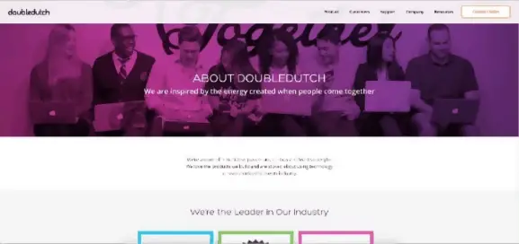
Double Dutch
Talk about beauty, and this about us page comes to mind. DoubleDutch team used simple paragraphs to describe who they are, what they do and also giving visitors confidence in them. First, they introduced their brand with a couple of stats, positioning themselves as leaders in the industry, after which they introduce the team. In all, the big is mixed with beautiful colours and images of a happy team working together. This will definitely get your prospective customers.
Carbon Made
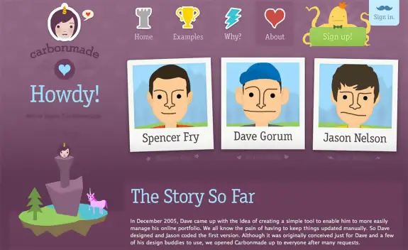
The first thing everyone wants to see when they click on the “about page” is who and what you are. The main reason why we love this website is that it’s not just sales orientated, it is personal, and it tells us who carbon is. Carbon is an online portfolio tool, and they have been around for a very long time, that shows credibility and experience. If you want to know more about carbon and what they do, visit this link.
Nordkapp
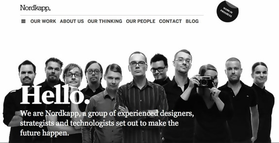
If you are looking for a website that is not only professional but catchy, Nordkapp is the website you’ve been looking for. But what or who exactly is Nordkapp? Nordkapp is an innovation and design consultancy that help clients discover growth opportunities in trends and technology. We love this website because it is just professional but minimalistic.
Yellow Leaf Hammocks
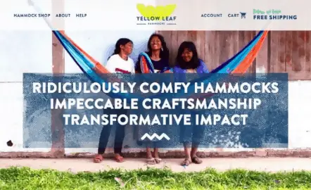
When you visit the Yellow Leaf Hammocks about us page, you will notice how they have been able to tell a story. This is actually what gets people to like your brand or business, a good story with a noble cause. Their story narrates how you directly impact someone’s life by purchasing a hammock. It means artisans who weave these hammocks and their families are greatly impacted. The page tells you exactly what they are selling with their goal and vision.
Ipolecat
Who doesn’t love a beautiful website, well I do! Polecat is a beautiful website with rich themes. It is also very straightforward. But what exactly is Polecat? Polecat is a digital agency, and their website screams digital agency. They make apps for start-ups and enterprises. We love the Polecat website, and that is why it is here on this list.
Simple as Milk
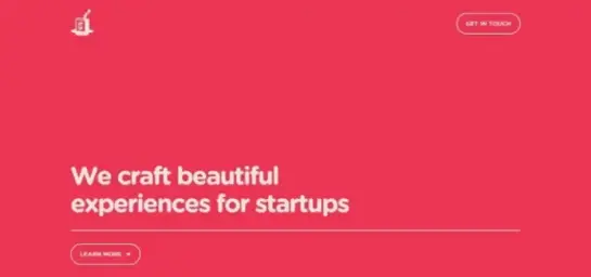
If you want a simple about us page design then this next one is definitely what you are looking for. Using a single-page design, this site describes what they do and who they are in simple terms. In the introductory part, it goes further to state that they “craft beautiful experiences for startups”. Its intuitive UX design portrays strong evidence of what they do with a friendly, warm and clear message of “there are more team members”.
Engage Interactive
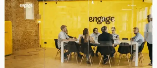
The guys at Engage Interactive did a wonderful job with their about us page and totally something different from the norm. They did not include any headline of some sort or even text to describe what they do and who they are. In this case, the picture does the talking and it surely works for them. Images show their team working and a bit of text about what they do and services offered, then more images. It might look too simple but it sure shows you can break the rules sometimes.
Cultivated Wit
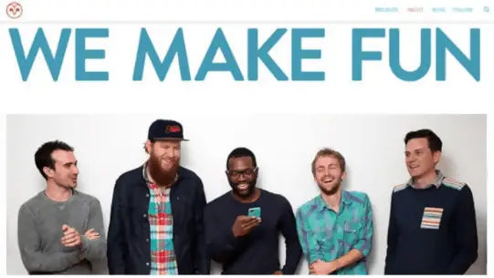
Cultivated Wit here used images again just like some of the other designs to showcase what they do and who they are. This clearly shows how to use images to connect a persona and business or brand. The headline is also another noteworthy item on the about us page which reads “We Make Fun”. Well, if you think these guys are not serious, below the page they list out their various achievements as a team and also individual accolades. As if that’s not enough, they also add proof of top clients and collaborations. How fun!
Rent the Runway
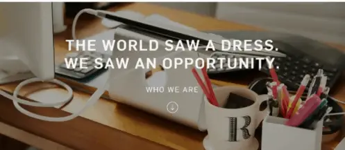
This next about is page has a lot of things we can learn from, such as a winning design, wide imagery, employee, testimonials, and a highly converting headline. So, the killer feature from this about us page is the employee testimonial, it is a clear sign that the employer is doing a great job even before clients engage their service. It just shows the difference in doing the job and smiling while doing what you love. If a company treats her employees comfortably, then it will surely take good care of clients.
Next Space
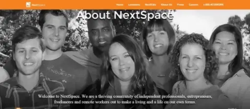
Using stock images on your about us page might work but real photos from real people or team members do a better job. NextSpace is all about teamwork and people from different fields working together in the same space, hence the use of “We” and “You” in their about us body text. It shows that NextSpace is focused on other people looking to do something in life. This is even stated in their body text that they help others make a living based on their own agreements and terms. Seeing this for the first time as a customer, you will definitely be convinced to use their services.
Paravel
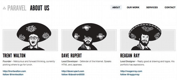
The Paravel website has a straight forward “about us” page, and we love straight forward pages. The first view at the page shows the whole team and their contact so you can always connect with them and send them your feedback. The page is minimalistic and informative, and that’s why we love it.
Anton & Irene
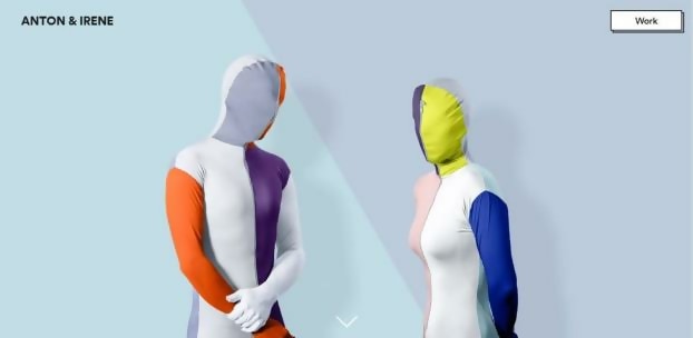
Anton & Irene is a Manhattan-based design agency. The website is one of the most unique websites you will ever see. We can proudly call it a unique website because their website takes parallax scrolling from 0 to 100. The bold colours, snowy effects, and visuals create a user experience you will never forget.
Pierro Caron Page
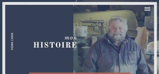
This about us page is for one of the great French artisan sculptors known as Pierro Caron. We are obsessed with his page because it describes the man in an honest way with great regard to handcrafted sculptures, wood and more. Every word and visual on his page tells a story about the richness of wood. We are truly blessed to have wood. His website is easy to read, neat and filled with quotes and photos of his past works.
Blake Suarez
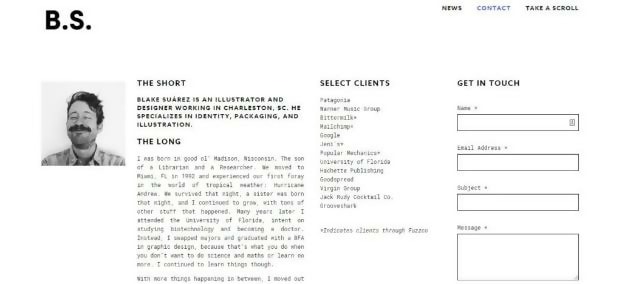
Who can resist the charm of a good bio? Absolutely no one. We love his web folio because it is personal and inspiring. It is an inspiring piece of how this man’s baby sister was born on the very night he survived a hurricane (Hurricane Andrew). But who is the man behind the excellent website? Blake Suárez is a designer and illustrator with a great sense of humour. Well, who is a designer without humour? His quirkiness comes through all thanks to his goofy picture and humorous tone.
LessFilms
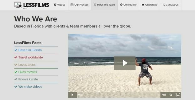
If you were asked to document your whole life in five minutes, how would you do it? What communication tool would you use for such a purpose to show your awesome life to people? Without any doubt, it’d be video. LessFilms is a Florida based video production company with team members and clients all over the world. The one thing we love about their about page is the humorous 50-second video that pops us along with a short list of facts that show their love for travel, tacos, and of course, karate. The short video and list of events give a glimpse of everything you’d expect to see on the website.
DoomTree
Have you ever created a video or recipe out of mistake and it becomes the latest thing, like wow! Do you know that feeling? That’s what DoomTree’s page is all about. The page describes how these friends built a record label which they have been able to make money off in the city of Minneapolis. However, it’s not the story that made us fall totally in love with the page. It is the audios and visuals that made us fall in love. The page just explained to us that writing is not everything, we are all visual beings, so why write when you can show. We don’t want to be the only one seeing the magic, check their ‘About Us’ page to listen to their songs, meet their fabulous crew and get the latest news.

Cupcakes and Cashmere
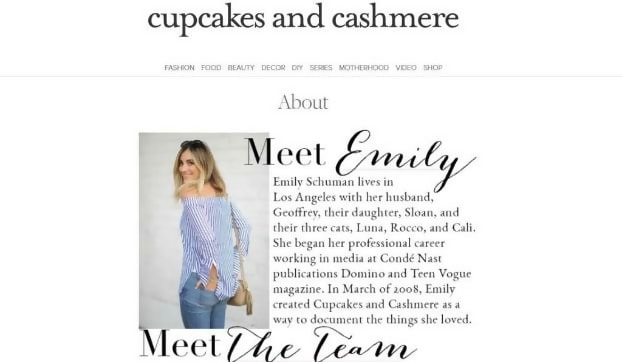
Just like the name “cupcakes and cashmere” implies, on this page, you will find almost everything on fashion, beauty, food, home décor and much more. The reason why we love this page is that it doesn’t showcase the only lifestyle, it is also personal. On the About section of the page, you get introduced to the team that makes the website beautiful and easy to read. You also get to learn about the founder of the site, Emily Schuman, her fashion collections, blog, and books. You can always say hi to Emily whenever you like as you get links to her social media pages and online store.
Mail Chimp
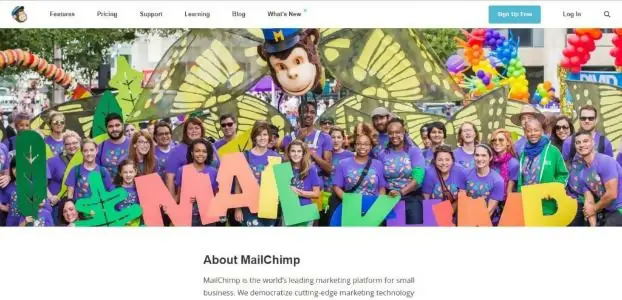
MailChimp is famous amongst a lot of people in the millions, it is used for email marketing purposes. The About Page is a smart way to talk to your customers and offer them more services. This is what MailChimp is banking on, as they use, they’re About Page as a sort of pre-sales platform. We do love this about us page because it is minimal, fun, colourful, effective, and most importantly, it is a blend of diversity.
Lonely Planet
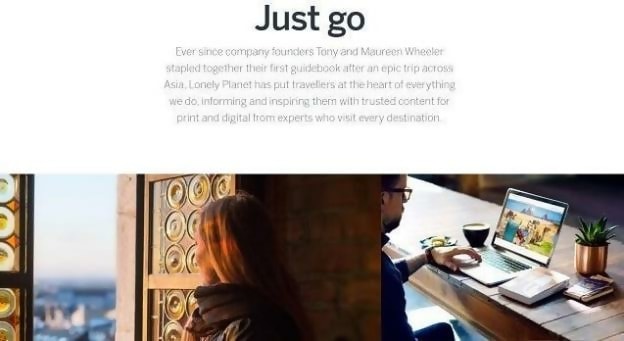
If you are a traveller and you want to see a website that takes you out of the world without leaving a spot, you should check this website out. This is a website that is custom made for travellers and people eager to explore. While moving down the page, you will notice that Lonely Planet stands for something and also offers certain services. Why we love this website? This website is stress-free, it doesn’t link you to several other places, as you see everything you need in one go and you get to decide what you want. You can View their app and get their printed guides if you want more inspiration. If you are ready to explore, visit their website now.
Gummisig
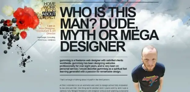
Gummisig? What or who exactly is Gummisig? This is an about us page for a freelance web designer, who has done an amazing job writing a “me page”. If you love websites with over-sized texts, then you should check this website out. Why do we love about his page? The top point is how he has been able to sell himself without actually doing the selling. The page introduces Gummisig’s portfolio, but not in a strict manner. His portfolio brings out his professional nature as well as his friendly and free-spirited nature. Although he has worked for many big companies in the past, you don’t have to feel intimidated as he is open for new collaborations. One of the main reasons why we can’t get over his site is because it showcases his portfolio humbly. Even when he speaks about working with big companies, he does so in a polite manner.
Chattanooga Renaissance Fund
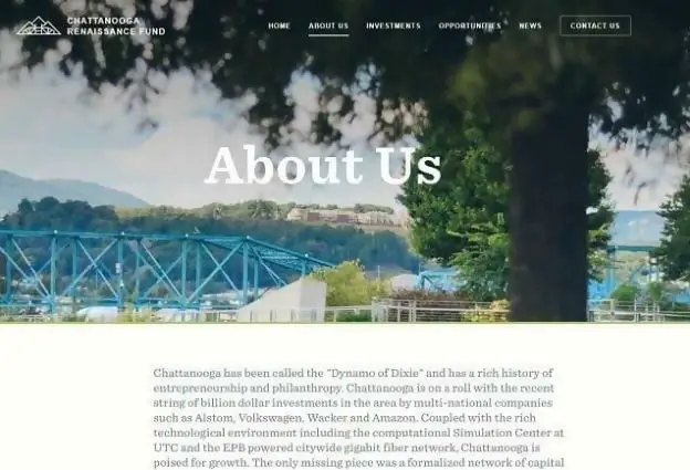
We love pages that go straight to the point, and that is why we love the ‘Chattanooga Renaissance Fund’ page. It is straight to the point as its primary purpose is to attract entrepreneurs. But How? Everyone loves to see social proof, and that is what the page is banking on. The social proof will catch your attention and make you wonder why companies moved to Chattanooga. After going through their page, you will be convinced that they want to help you. Be you an investor, startup, or the third party, there is always something for you on the page.
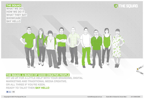
The Squad
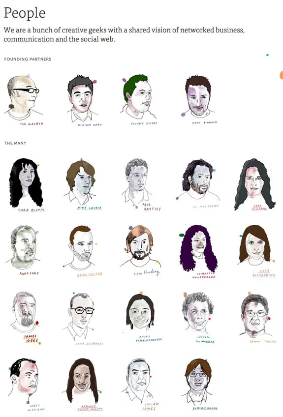
Made by Many
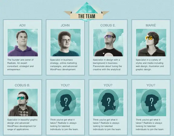
Radiiate
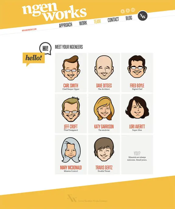
Ngen Works
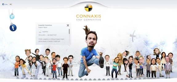
Connaxis
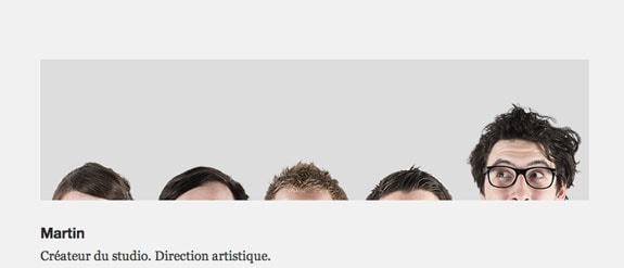
Studio Breakfast
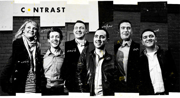
Contrast
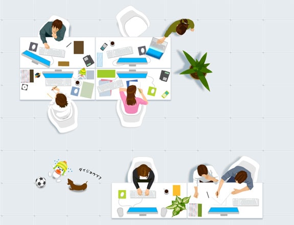
Studioespace
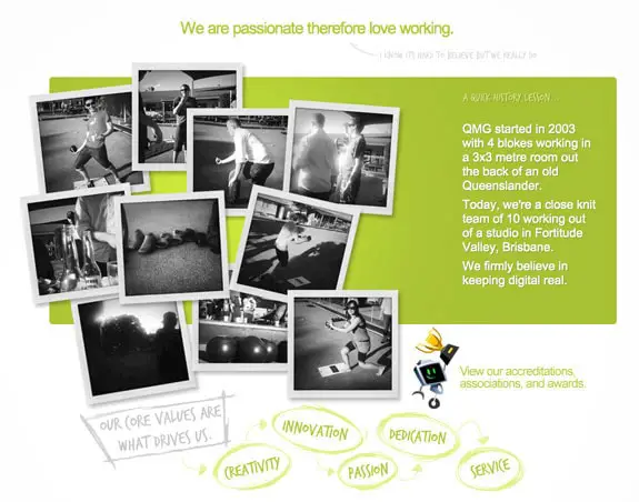
Qmg
Conclusion
A website portfolio is one of the trickiest pages to build, as it must be informative and appealing. It takes a lot of time and strategy to build it so, if you are trying to create your “About Us” page and you don’t know where to start, we got you. We hope this article and the 25 Most Creative “About Us” page designs we found on the internet has helped you in making design decisions. The designs cut across every niche, and it will fit into any business. If you have seen other websites with amazing designs, please feel free to share or add in the comments below. We’d love to see them.

