Timelines are very important as they are used for various things on various platforms. Authors use timelines in books, lessons and articles to explain an event, the reason it occurred, the way it occurred and the date the event happened. Business owners and professionals also use them on their sites in order to keep things organized and arranged. The creators of social media platforms like Facebook made it in such a way that every user has a timeline where his/her pictures, posts and every other thing relating to the person would be displayed.
Best Free Timeline HTML and CSS
It is pertinent to note that, there are two types of timelines, the vertical timeline and the horizontal timeline. For the vertical timeline, contents are separated by vertical lines while horizontal lines separate contents under horizontal timelines. We have compiled a list of various horizontal timelines that can be used for different sites, books, articles and so on.
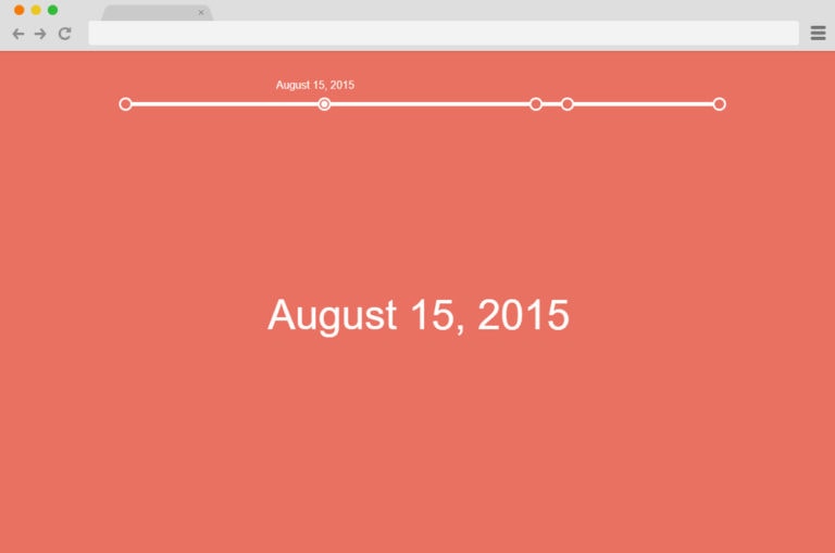
Horizontal Timeline inspired by Cody house
This timeline is beautiful and easy to use. It is laced with a simple but fascinating design. The developers made use of Java Scripts to add the effects that made this timeline fascinating. Although dates might appear in the content section, you can edit it however you want.
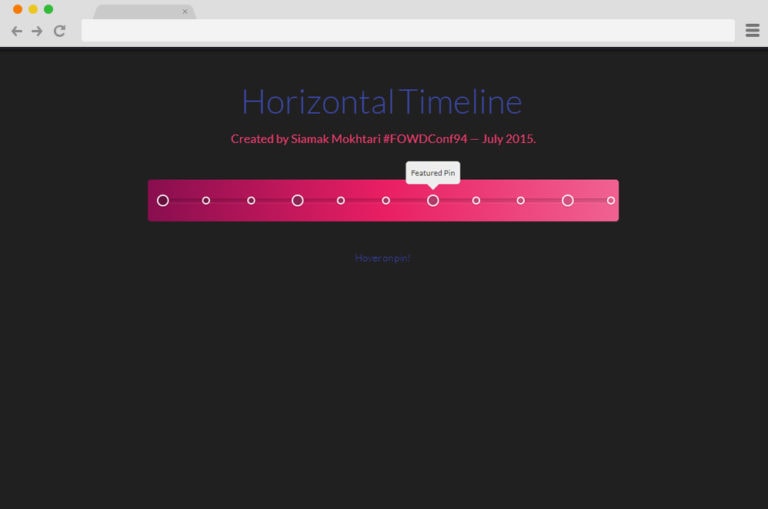
Horizontal Timeline
Just like the name, it is laced with pink horizontal lines that have different sizes of circles on them. These circles are referred to as pins and when hovered over, certain important contents regarding a site appears. Although this timeline is not detailed, it is easy to use as it was developed using CSS and HTML script.
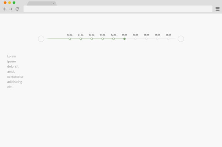
Horizontal Timeline Ex
This timeline would definitely catch the attention of users. It has a grey horizontal line with little nodes and spheres at both sides of the line can be used to display various things ranging from dates, events, achievements etc. While the spheres are used for navigating, the nodes display information and they often change colour when clicked upon.
JQuery Horizontal Timeline
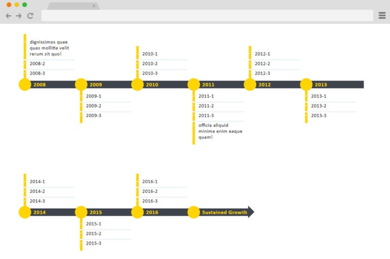
It has a simple, colourful, and responsive design. It has a mix of both horizontal and vertical lines, horizontal lines appear at the top while vertical lines appear later. Although the line mixture depends on the screen size. It also contains columns where contents are displayed and an even alignment which makes the timeline fascinating.
Horizontal and vertical Timeline
Just like the name, it contains both vertical and horizontal line structures that designers can choose from. It has a simple colour and design scheme. It contains icons and markers that make it more appealing. It was created based on CSS and HTML styling code.
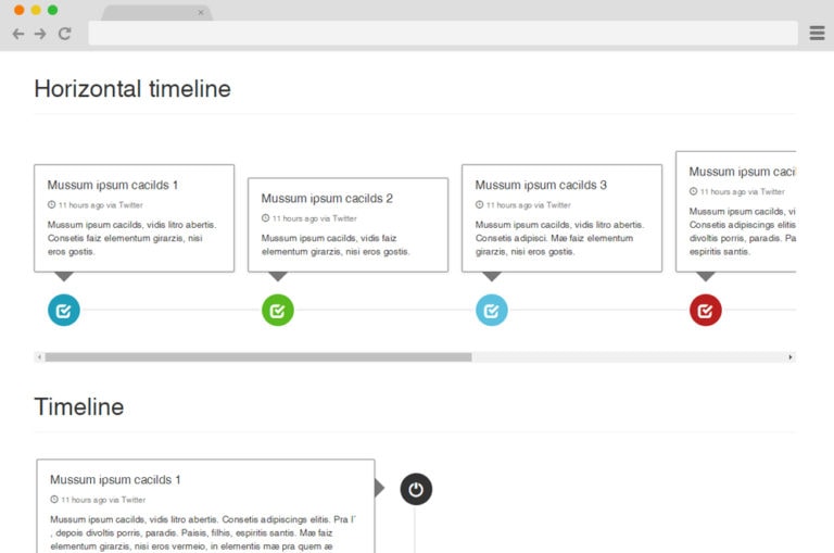
Timeline
It was developed using CSS, HTML and Js animations and effect in order to give it a colourful effect despite its cool nature. The timeline is laced with contrasting but beautiful colour schemes, amazing animation structure, a white line indicator, small nodes or makers to display dates and a dazzling click and hover effect which makes colour changes possible.

Horizontal Animated Timeline
Aside from the brighter colour scheme, it is similar to the timeline. While the former has a darker colour scheme, the latter has a brighter one. It has the mind-blowing feature of detecting the beginning and end of a timeline.
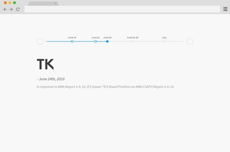
4 Panel Timeline CSS
The features are so striking and wonderful that it is difficult to believe that it is a product of CSS and HTML script. Texts and images are displayed in a creative manner. It has a dazzling hover effect and four even columns for text display.
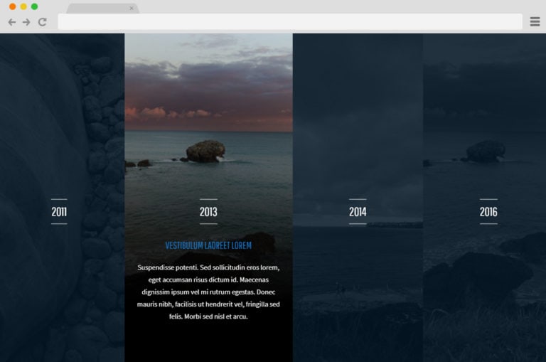
Timeline Sequence
Just like the panel timeline, it is a classy and unique timeline that may seem a little difficult for beginners. Texts are displayed with slides. The well-commented codes, amazing background and beautiful slides make it a whole new level of an invention created based on JS angular mode and CSS animations.
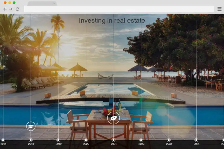
Horizontal Timeline Mockup
Xin Yao created this next level timeline by stacking images and combine it with amazing animation effects. CSS, HTML as well as JS were used to create this timeline where images slide across the screen when you hover over them and such pictures could expand.
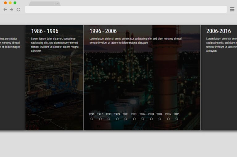
Wedding Timeline
This timeline is perfect for a wedding, engagement or any occasion. It has a simple but classy and amazing design, with a white and blue background. The contents, pictures and dates are simply but properly structured with a scroll bar added for navigation.
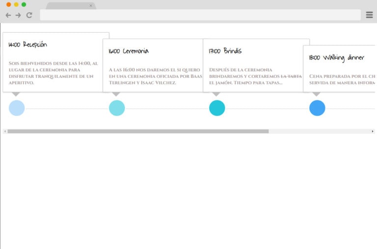
Horizontal Timeline Experiment
It has a straight line laced with blue circles drawn across from one side to the other. Above the line, there’s a card that contains dates, events and other information, when you click on the text of your choice the rest fades out.
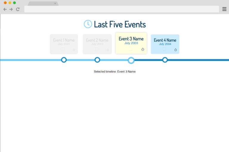
Responsive Timeline V3
This is a simple, classy and responsive timeline that was created based on CSS, JS and HTML script. It has a straight line drawn from one end to another that is laced with circles that displays the year an event occurs. We should note that when we click on the circles they turn a darker shade.
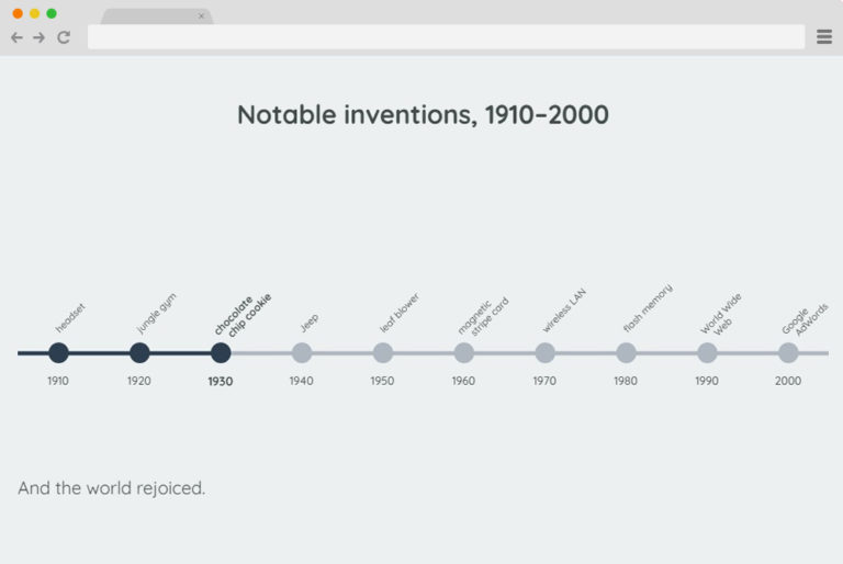
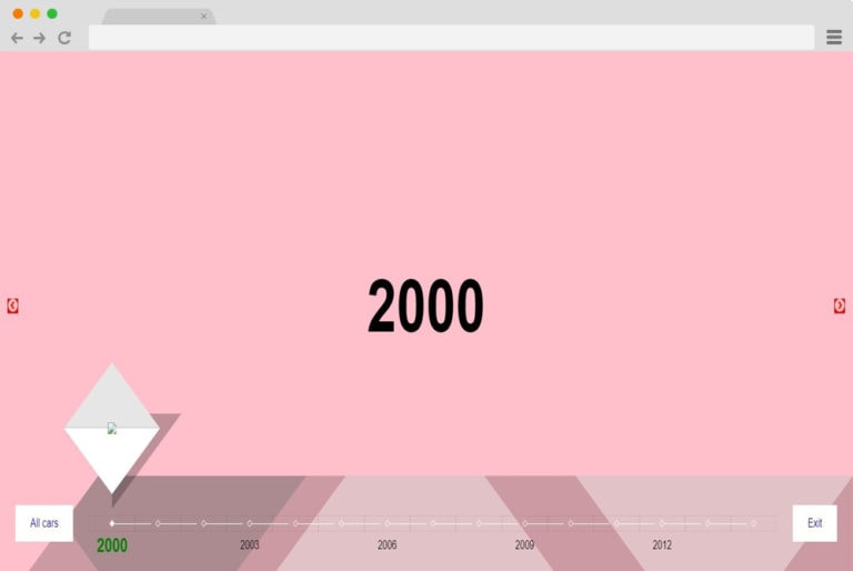
Horizontal Timeline
: The developer, Sanda did an amazing job. This timeline has a wonderful colour pattern, variety of shapes and texts. The shapes come into view when you click on different areas of the timeline. The dates are written above the timeline while two navigation button is located at the left and right end.
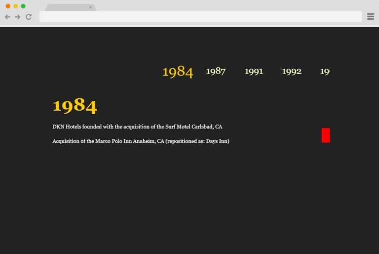
Horizontal Timeline by Alberto
This is a classy and responsive timeline that has a black ground colour with a touch of neon. It is designed in such a way that contents/events are displayed according to how you select them. When you click on content, a simple but amazing hover effect of colour change and slide occurs.
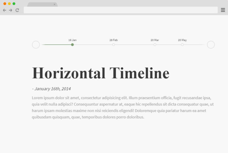
Horizontal Timeline by Ritesh Kumar
This is a simple, classy and responsive timeline that was created using CSS, HTML and JS script. Despite its simplicity, it is laced with a sophisticated design. Its next-level animation effects and easily accessible navigation buttons located at either side of the timeline make it a pretty great deal.
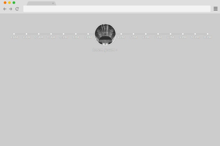
Animated Circle Timeline
Using CSS and JS animations, the creator invented this timeline that has a horizontal line that’s laced with circles which are referred to as markers. Just like the name it has an animated circle which appears over a marker while events are being showcased. This magic occurs when you hover over a marker.
Horizontal Timeline
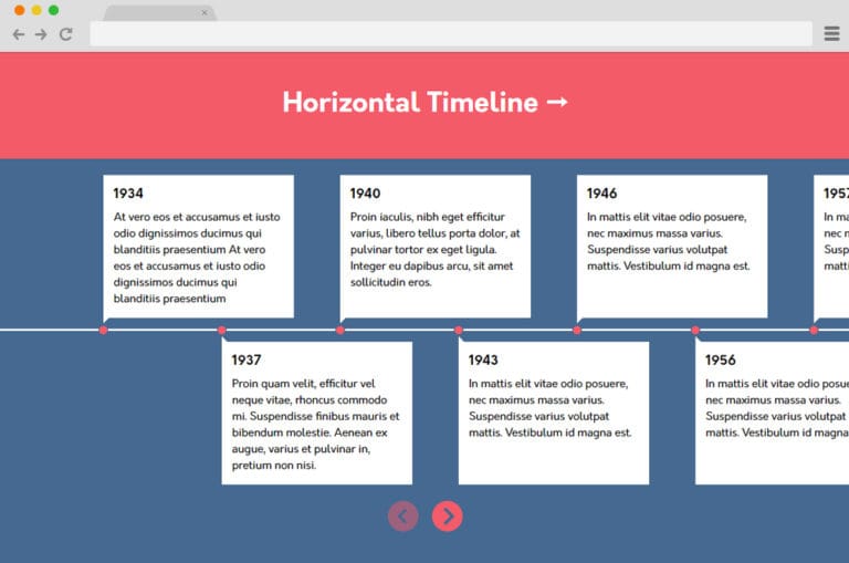
This is a simple but interesting timeline that has an eye-catching colour scheme. It has a simple white horizontal line that is drawn from one end to another with red dots on top of the line. Dates and events are written in the content boxes that appear above or beneath the horizontal line.
Responsive History Timeline
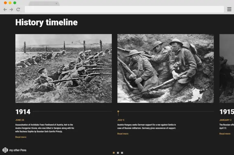
Like the name, it was created for explaining events and their dates. It has the monochrome black and white theme colour and a section of image headers in which dates and contents are written underneath. At the lower part of the sections, it has navigation buttons which makes scrolling easy.
Horizontal Timeline Slick
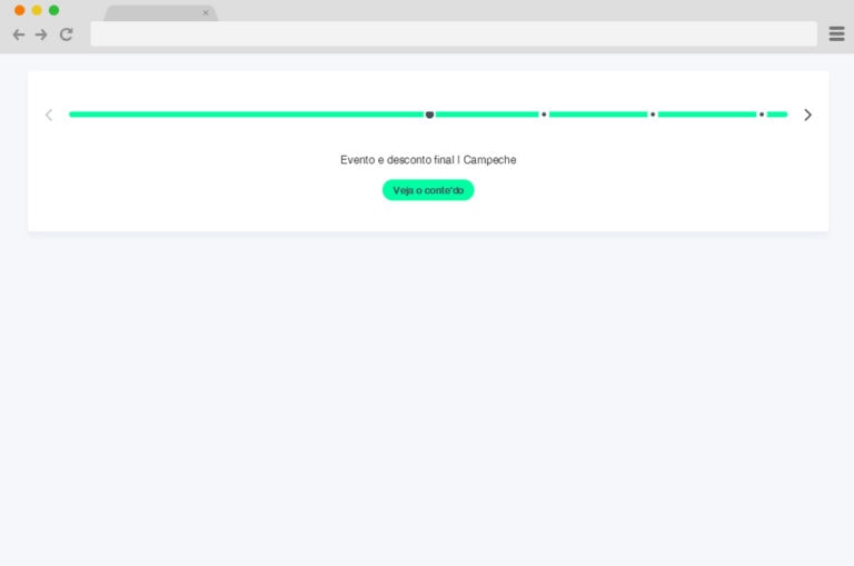
It is simple but fascinating, it’s background colour mix of white and neon makes it top notch. The contents are written below the horizontal line and you can add the sources of your content while its markers and navigation buttons that make the timeline easy to use.
Conclusion
Timelines are important design elements and we hope this article will guide your choice. Please share with your loved ones and visit our social media handles for more exciting articles.

