Have you ever wondered why you signed up on a particular website, downloaded Dropbox, Evernote, or even taken an online masterclass? Well, it would shock you to know that you were prompted by these site or service owners, into taking that particular action. If you are also wondering how then the following explanation should help clear the air for you.
Every time you visit a site or see an ad on social media or Google search and so on; you get asked to take an action. This act is known as “Call to Action” or CTA. This process is especially implemented by website owners who are offering or selling their services to their consumers. Let’s say, for instance, you visit amazon for the first time, you will be bombarded with different discount types while also prompting you to signup to enjoy these benefits. That is call-to-action working!
10 Free CSS Call-To-Action Buttons for Your Website
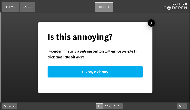
Pulsing CTA Button
This is one type of call-to-action button, will get the attention of all your site visitors because of its constant glow like a pulse hence its name. The author used CSS delay to create the animation with a pulse that makes its outer parts glow repeatedly. Clicking the “X” only pops this CTA back up instead which means visitors must click “Go On, Click Me” to continue. The CSS code is editable to create whatever suits your CTA needs, so check it out now.
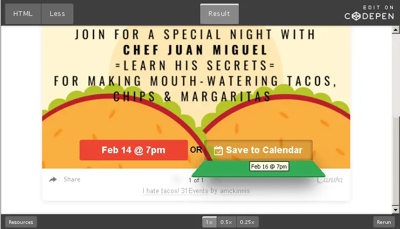
Flip-Down CTA Buttons
This is a 3D animated call-to-action button that you can include on your website. This is created by Arnie McKinnis and it uses CSS transform which gives this CTA button a flip-down effect on mouse hover. The main link is hidden under the button which can be clicked by hovering over it. It is captivating and eye-catching!
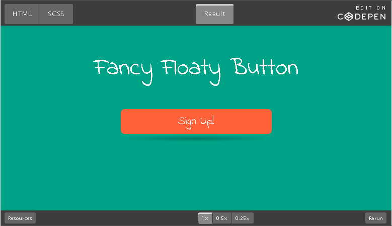
Fancy Floating CTA Button
Looking for something special and unique? This fancy floating CTA button is perfect and not very common on the internet. The designer used a repeating animation and CSS3 to create the drop shadow which gives this button a floating effect. It is also editable if you want to customize this button all you have to do is copy the CSS code and replicate it on your site.
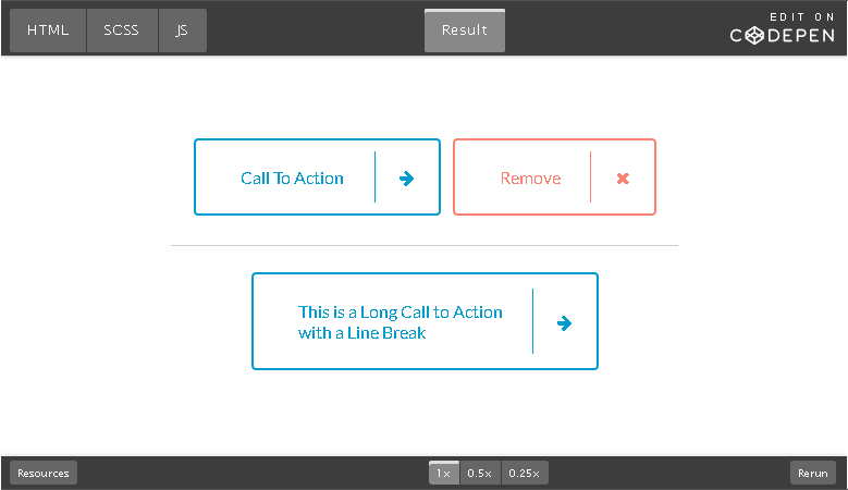
Micro CTA Interaction Buttons
Phil Hoyt is the designer of these impressive call-to-action buttons. If you love simple but fancy animation effects then the micro CTA interaction buttons is a great example. The buttons are transparent by hovering on it, the link slides in depending on what action you want visitors to take. It looks great but if you don’t have the right icon for the button behaviour, then you might experience some challenges using it on your site.
YouTube CTA Button
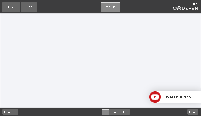
This is a simple CTA button for driving people to other sites that include videos and so on. It might not work very well for what you want to use it but the idea is unique and cool. The button is placed on the lower-right corner of your website and by hovering on the button, the call-to-action appears. You can use this to promote, videos, links to online courses, deals, and many more.
Green Circled CTA Button
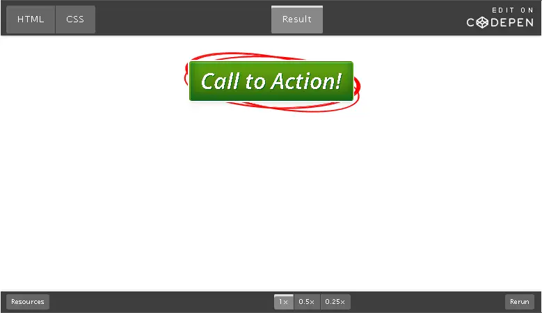
A lot of people have used something like this for call-to-action on their landing pages most especially those selling eBooks, promoting offers, and so on, on the internet. The red circle around the CTA button makes emphasis so site visitors will know they obviously have to click on it. The hover effect is awesome such that you see the changes in both the green button and the red circle. This will definitely grab the attention of visitors on your site and is easy to implement on any site.
Bordered CTA Buttons
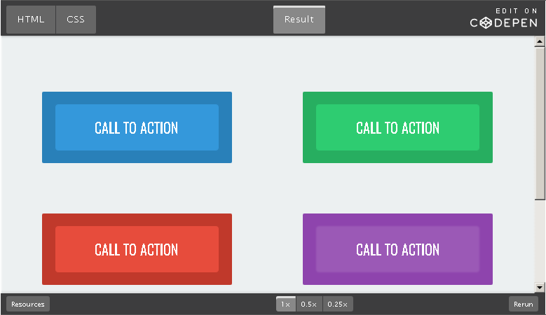
This is another awesome animated collection of call-to-action buttons that you can use on your website. It is easy to customize and implement, the designer used custom colours for the background s to create border effects which can be seen while hovering on the buttons. If you want to add something simple and colourful to your site, then give this a try today.
Gradient Styles CTA Buttons
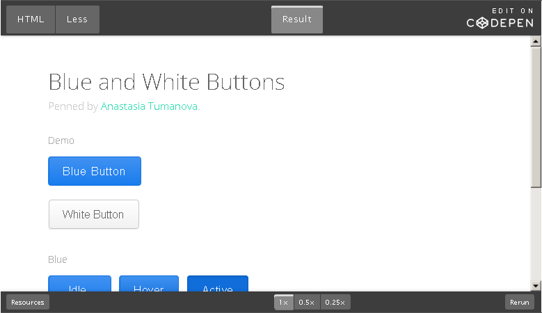
Well, if you are interested in the classics, then the gradient styles CTA buttons will do. If you want to keep things normal within the colour format such as when the button is idle, hovered on or clicked, then you can try this CTA buttons. The designer used less CSS making it easier to create dark gradient colours with percentages instead of hex codes. To enjoy this CTA button, you must make sure they blend with your website’s layout.
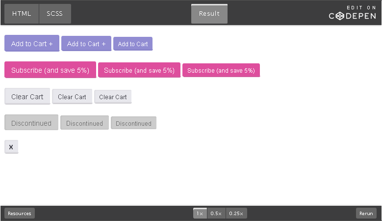
Colourful CTA Buttons
This type of CTA buttons is very easy to use, small and colourful, although the colours can also be changed from the CSS code to fit your needs. It is a creation of Rohan Nair and the designer really did a great job here. The click effect is simple and feels like the button is pushed into the webpage. The pure CSS makes it easy to copy, paste and customize for your projects.
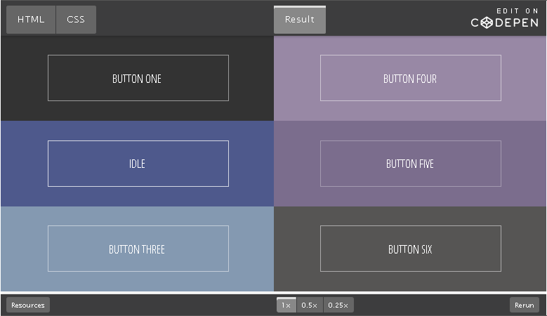
Pure CSS CTA Buttons with Hover Effects
This is among the favourite on this list, here, the designer has focused basically on hover effects rather than colours, designs and so on. This is a pure CSS call-to-action button collection meaning you can copy and paste and edit to match your site’s design. The buttons do not have borders but when you hover on it, you notice effects that create animated borders. It is not easy to customize but if you have CSS knowledge, it shouldn’t be a problem.
Best Call-to-Action (CTAs) Examples For Sales
It helps guide your site visitors through the whole process they need to get them to purchase something on your site, signup for a class or download a file. This process is known as strategic CTA and it is very important for any business to implement on their website, apps and so on. Generally, CTA is that particular part or selling point in an advertisement, on a webpage, or even a small content which designed to encourage and push prospective customers into doing something.
In marketing, what CTA does is to convert visitors, viewers, readers and many more into leads for a business’ sales team. Depending on the actual goal that needs to be achieved, CTA will drive all kinds of different actions for any business. Come to think of it, if you were not guided through the whole signup process on that your favourite website, app and so on; do you think you would have a lot of apps and websites like you do now? My guess is, you would probably have fewer to no apps and websites today.
Below are some of the very few types of CTAs you can use to get your site visitors to do something:
Sign up
This type of CTA invites your audience to signup on a website, app, a free trial, events, online course, or software depending on the set goal.
Subscribe
This type of CTA is not geared towards any purchases but invites your audience to subscribe and get information or updates from a company or business. It is mostly used to drive more readers to a company or business blog.
Free Trial
This is one of the catchiest CTA and every company or business uses it to drive traffic and generate leads by offering a free trial period for audiences that signup or preview a demo product and service before actually deciding whether to go for the product or service.
Get started
This CTA is aimed at driving different types of audiences with a variety of actions for a business or company such as a free trial for software, games or other solutions.
Learn more
This is basically for business or companies that intend to give their potential customers a bit more information. It is mostly when they are offering a service or product, so this CTA will prep them into buying.
Join us
If you or your business/company manage an online community or have a collaborated service, then this CTA is a perfect choice. It helps you put a “Join Us” link to let those interested in what you do, for learning, inputs or advice.
All the aforementioned CTA types drive leads but for different purposes, it is best to note that the language and tone they carry along also vary. In today’s world of marketing, more exciting and effective creative ideas have been put into the Call-to-Action for lead generations depending on what a company or business wants. We have taken the time out to list out 25 highly effective CTA examples that work perfectly well for some top brands, in order to call their potential customers to action.
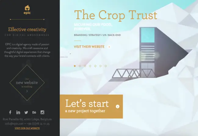
EPIC CTA Button
EPIC is a digital agency and the team showcases what they do primarily through the homepage. This agency greets everyone who visits their page with animated videos that highlight what they do; who they have worked with; and what they did for their clients. While the animated video rotates on a carousel, the CTA button stands out with the phrase “Let’s start a new project together”. It shows that the folks at EPIC are a team and they carry their clients along. Who would need their services and not click on that!
Netflix CTA Button
Netflix is a major streaming service that you can sign up, subscribe and stream a lot of high-quality videos online. In order to make sure anyone that lands on their homepage sign up for their services, the Netflix team included a CTA that gives site visitors complete control. They offer a month free trial to potential customers to get the hang of it before they actually sign up. The CTA button reads, “Join Free for a Month” and just above it is another catchphrase “Watch anywhere. Cancel anytime.” So, you can sign up for the free trial and cancel anytime you are not satisfied with the result. This assurance definitely makes it an amazing call to action.

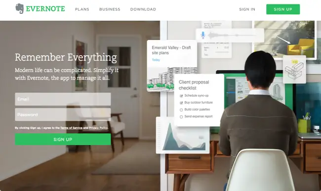
Evernote CTA Button
When you visit the Evernote website, the first thing you see is the creativity they have put into making sure visitors convert from the homepage. It is a super exciting and very simple setup that lets users understand the value of using their app and the whole sign up process. The CTA button is accompanied by an interesting message “Remember Everything” which explains why you need this app to organize your day-to-day plans and activities.
OfficeVibe CTA Button
Here, the OfficeVibe website uses the subscribe call-to-action to drive leads for more readership. One good thing about the type of CTA button they have used is the fact that it slides in from the bottom of the page as you scroll through their blog. It is catchy and simple but also highly effective. It is used to call the attention of visitors to what they are already interested in or currently reading on the blog.

Dropbox CTA Button
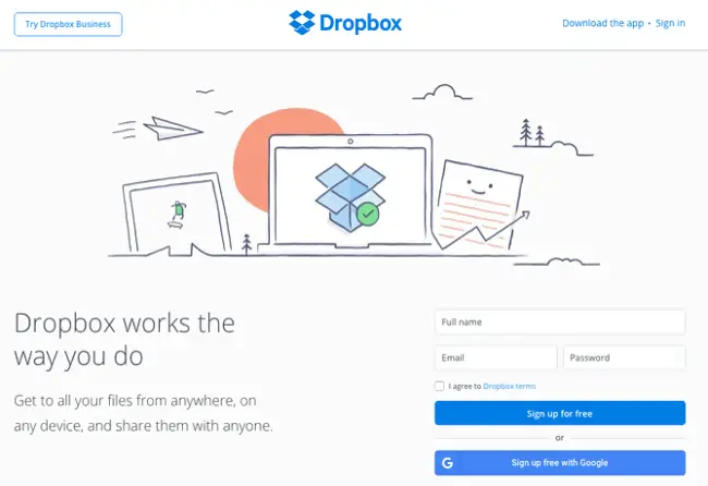
Dropbox has always been about their simple touch and taste in designs which is visible even from the graphics they used on their websites’ homepage. To keep things subtle and simple, they included a simple CTA button “Sign up for free” with a distinctive colour blue. The Dropbox logo and the CTA button share similar colours which show synergy in the design making it easy for visitors to find their way around the site.
Square CTA Button
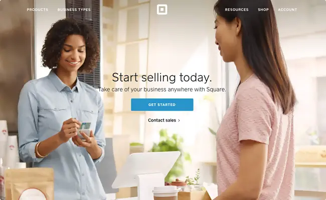
The CTA design consists of some key elements must be considered to make it highly effective, it is not just a button to be clicked by visitors. Things like a good background image and colours should be considered, and also the text surrounding the page. In this example, the guys at Square used a single colourful image promoting their product, and a “Get Started” CTA waiting for you to click. The CTA button’s colour and the credit card held by the lady carries the same colour, this keeps things simple and easy for visitors to get along.
Aquaspresso CTA Button
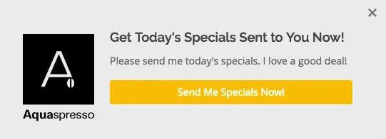
This is another type of subscribe CTA button used by Aquaspresso to get leads for the blog page. This coffee company got it right by including a pop-up CTA which offers their readers more information about the days special. Send Me Specials Now; is the CTA phrase that gets your attention once you land on their main blog page, it drives visitors into thinking today’s special might be scarce if they don’t get what they want now. It is very effective, simple and subtle.
Treehouse CTA Button
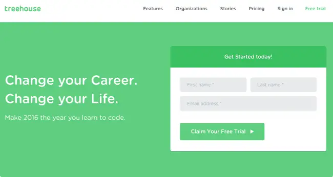
As usual, most companies or businesses just go with the phrase “start a free trial’ but Treehouse uses another method to get its visitors to stay on their website. The CTA catchphrase there is “Claim Your Free Trial” which lets you know it is for you and all you need to do is put in your info and click. The site is colourful with all colours matching the treehouse logo.
IMPACT Branding & Design CTA Button
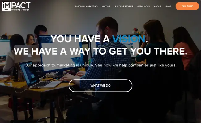
This marketing company offers branding and design services to clients with a vision. Their aim is to get you where you want to be as a customer, so, if you land on their homepage, creativity hits you. It is also noteworthy that you use winning words around your CTA just the way the folks at IMPACT did, they used challenging words “What We Do” to ensure visitors learn more about what they do before taking another step. The sweet thing about their CTA button is the fact that it does not include any action verb, yet it is still very effective.
Brooks Running CTA Button
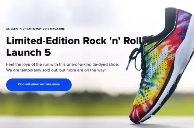
CTAs can be used in many different ways depending on what the goal of a business or company is all about. In this example, Brooks Running, ensures their customers and visitors don’t go elsewhere to find what they are looking for by using this powerful call-to-action “Find Out When We Have More”. Sometimes you visit a site to buy a product or item and discover it is out of stock, Brooks Running leaves no room for such disappointments. By clicking the CTA button, you are directed to another page where you get a code to text the company and Brooks automatically send you availability alerts for the shoes you want.
Uber CTA Button
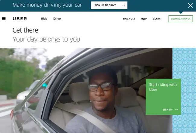
The folks at Uber are looking to drive traffic from two different categories of people, which is riders and drivers. The CTA buttons used on their homepage are simple and straightforward. They used videos playing in the background showing riders and drivers from locations around the globe having an amazing time. The CTA catchphrase for drivers are located at the top of the website saying “Make money driving your car: sign up to drive” while below is the riders CTA button which reads “Get there Your Day Belongs to You: Start riding with Uber.” It doesn’t get any simpler than this, it says what the people want to hear.
Prezi CTA Button
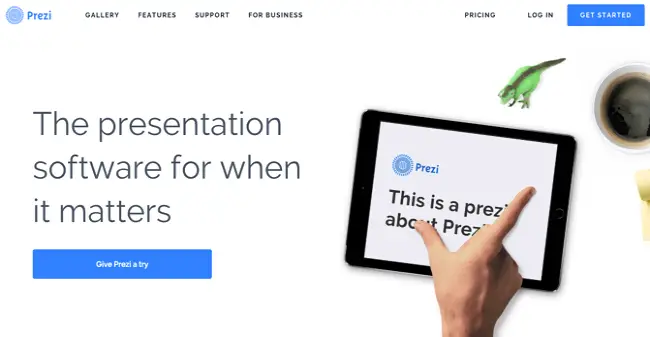
Prezi uses a subtle but deep language to communicate and drive visitors into buying their software. The main CTA button “Give Prezi a try” comes after the reassuring words about their product, while the secondary button “Get Started” can be seen at the top right corner of the page. Both actions will take you to the same pricing page where you can either try the software before paying for it of just paying for it right away. This is also an example of a two type CTA on a single website.
Panthera CTA Button
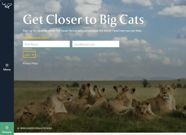
This website includes a call-to-action for wild cat lovers from all over the globe to join the pride in taking care of these animals. It is for this reason the Panthera team used this powerful keywords or phrase to speak directly to big cat lovers saying they should “Join the pride today.” Just below the phrase are two fields with the name and email option with the “Join” button asking you to take action. It is just simple and direct.
QuickSprout Slide-In CTA
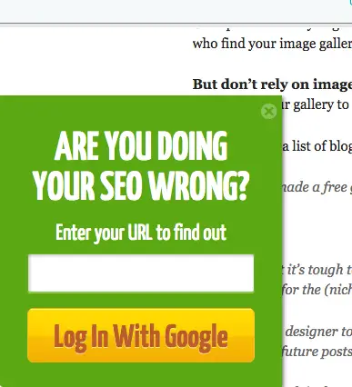
Talk about creativity and QuickSprout’s slide-in CTA comes to mind. It is one call-to-action that catches the attention of whoever needs their services and even those who think they don’t. Once you land on their blog post, as you read through to the middle of an article, the CTA greets you with the question, “Are you doing your SEO wrong?” well if you are or not you would want to give it a try and find out more by entering your URL. It is really captivating and converts very well.
Full Bundle CTA Button
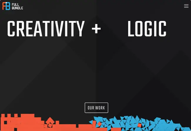
The Full Bundle team used simplicity to work the call-to-action on their homepage. As a marketing agency, they build online presences for their clients and so they must show what they do and who they have worked with so clients can take the next action. So, they placed their CTA button “Our Work” in a strategic manner on a dark grey background.
Grey Goose CTA Button
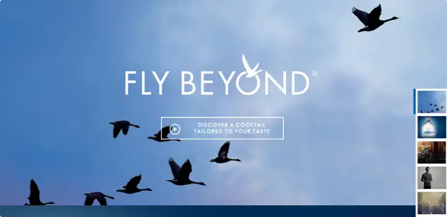
This Vodka brand offers its potential customers and site visitors a fun and distinct call-to-action that get them clicking further. The CTA button reads “Discover a Cocktail Tailored to Your Taste,” it is a pleasant phrase which leads visitors to a video further explaining in more details what to expect.
Blogging.org CTA Button
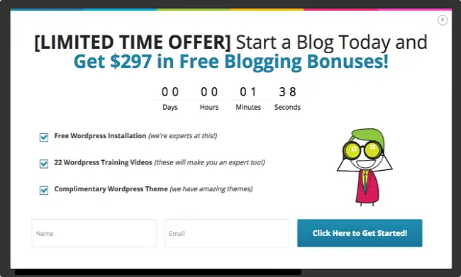
Blogging.org uses a Countdown Clock to prompt site visitors to take action on a particular offer. The CTA pops up showing a limited time offer with a timer counting down to indicate how long the offer will last. This shows site visitors that the offer won’t be available for long and they need to act fast. Just like Aquaspresso’s example in #7, it is another way to use the psychological tactic of scarcity to add value to the product or service. Most people would be curious to know what happens when the timer counts down, well, the page stays the same after it runs down to zero.
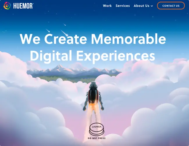
Huemor
Well for starters, the company that owns this website is “Huemor” which can go for humour. This can be seen on their homepage where the team used humour to call potential customers to action. The CTA carries a “Launch” button with a copy under it saying “Do not Press.” Imagine seeing that on a website and not being curious to press the button. This is reverse psychology in action and in a playful manner with Huemor! Yes, I did it too…
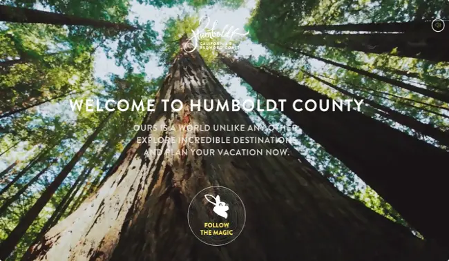
Humboldt County CTA Buttons
Humboldt County in California has an amazingly beautiful website, that is colourful with an exciting full-screen video as the homepage background. But one interesting feature it has is located at the bottom centre of the page, which is the call-to-action button, it carries the icon of a bunny and the phrase “Follow the Magic.” It is a good way to call tourists into a fairytale journey. But it doesn’t end there, this website has another call-to-action when you click this first one.
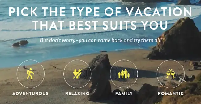
Upon clicking the CTA to follow the magic, it takes you to another page with options to choose from for a memorable adventure in the county. This type of CTA keeps site visitors engaged on your site.
Spotify
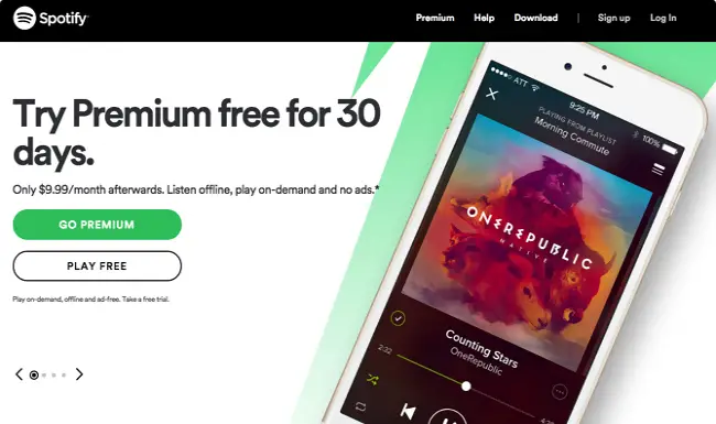
Spotify is one of the largest music streaming services on the internet and the moment you get to their homepage, it is obvious the main CTA is aimed at people who would pay for their premium services to “Go Premium”, while the secondary action is for those willing to sign up for free. The colours used for their CTA, states clearly the main action they want site visitors to carry out, which is to “Go Premium” in green. The secondary CTA which is “Play Free” is left in a plain white as the other part of the page background. This type of multiple CTA button is designed to draw the attention of visitors the premium option only.
Madewell
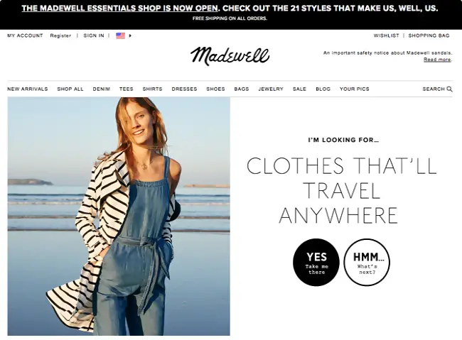
Another good example of multiple call-to-action buttons on a single website can be seen here. Madewell is a typical e-commerce website owned by J. Crew, and it stands out among other e-comm sites. The CTA on the website is also exceptional such that when you land on the homepage, the first thing that catches your attention is the phrase “I’m Looking For…Clothes That’ll Travel Anywhere.” The primary CTA can be seen in a black circle which says “Yes, Take Me There” while the secondary CTA which says “Hmm… What’s Next?” blends with the white background colour. The idea is to make sure site visitors click the primary CTA button which takes you to the travel clothes category, while the secondary takes you to other types of clothing available.
t.c. pharma CTA Buttons
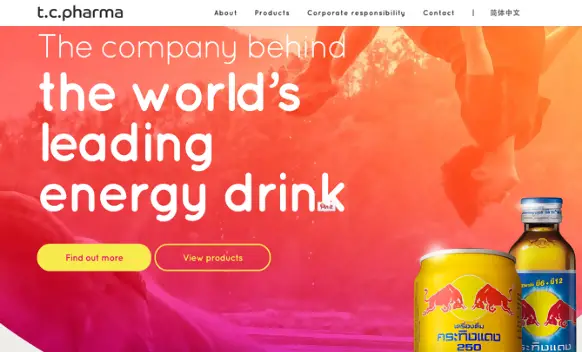
So, t.c. pharma owns Red Bull and it is a Thailand-based company that makes electrolyte beverages, snacks, energy drinks, and so on. Once on their homepage, you are greeted by two call-to-action buttons that read “Find out more” or “View products.” It is clear enough all they want is to drive traffic to find out more about their company.
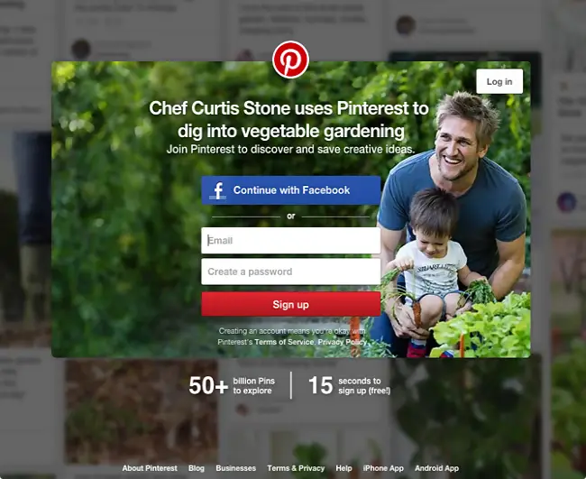
Pinterest is another site that uses multiple CTA buttons to drive traffic into taking action. If you intend to use their services, you have two options with the primary being to “Continue with Facebook.” This means you don’t have to fill the registration form, all you have to do is use your Facebook information, while the secondary CTA to create an account by filling the form boxes just above “Sign Up.” It is clear they want users to sign up using Facebook which is a faster way than filling the form.
Instagram CTA Buttons
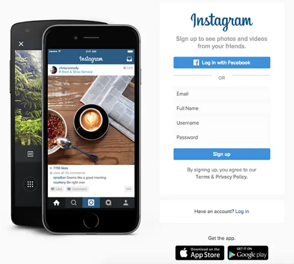
Instagram is one of the biggest social media sites in the world and it is owned by Facebook, so it is not strange or new. Since Instagram can only be enjoyed using their app, the primary objective is for users to download the app and enjoy its full features. The call-to-action buttons all lead to the same goal regardless, they have multiple CTAs which includes “Login with Facebook” for those who prefer the option. Anther CTA is the “Sign Up” and “Log in”, then further down the page where it says “Get the app” you see download on the App Store or Get it on Google Play.
General Assembly CTA Buttons
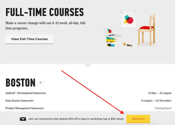
This website sells online courses for many who are interested, so, therefore, they have a lot of call-to-actions on their website. But the one we are looking at is the subscribe CTA button at the bottom of the homepage which makes sure you get email updates about new courses and so on. It is more colourful and users will easily notice it better which makes it the primary CTA. It is strategically placed at the bottom and highly effective.
With these examples, the use of call-to-action on websites and apps should be clearer to you by now. Based on the list above, it is very important to be creative with CTA buttons in order for it to drive traffic or leads to meet your goal and target. Below are some of the best CSS call-to-action buttons handpicked, that you can implement on your site easily by editing and adding your own catchy phrases to attract visitors.
Conclusion
Call-to-action is very essential on every website, I can’t imagine any website without it. Many businesses and organizations use CTA buttons on their websites to drive traffic in order to make sales, gain readers, subscribers, registered members and so much more. But regardless of whatever action is intended by a business or company, it is very important to have CTAs that capture the attention of visitors using a persuasive phrase rather than commanding terms. Reverse psychology can also do a great job when combined to create a CTA button on your site. Leave your comments below, follow our social media links and stay tuned for more updates.

